Logo redesign
Early in my career, I created my first award-winning logo while working at a boutique advertising and design agency. At the time, I wasn’t yet a senior designer — in fact, I wasn't even assigned to the project. After several unsuccessful rounds with a new banking client, I was unexpectedly asked to give it a go. And to be quite honest, it felt more like an act of desperation than a nod to my skills.
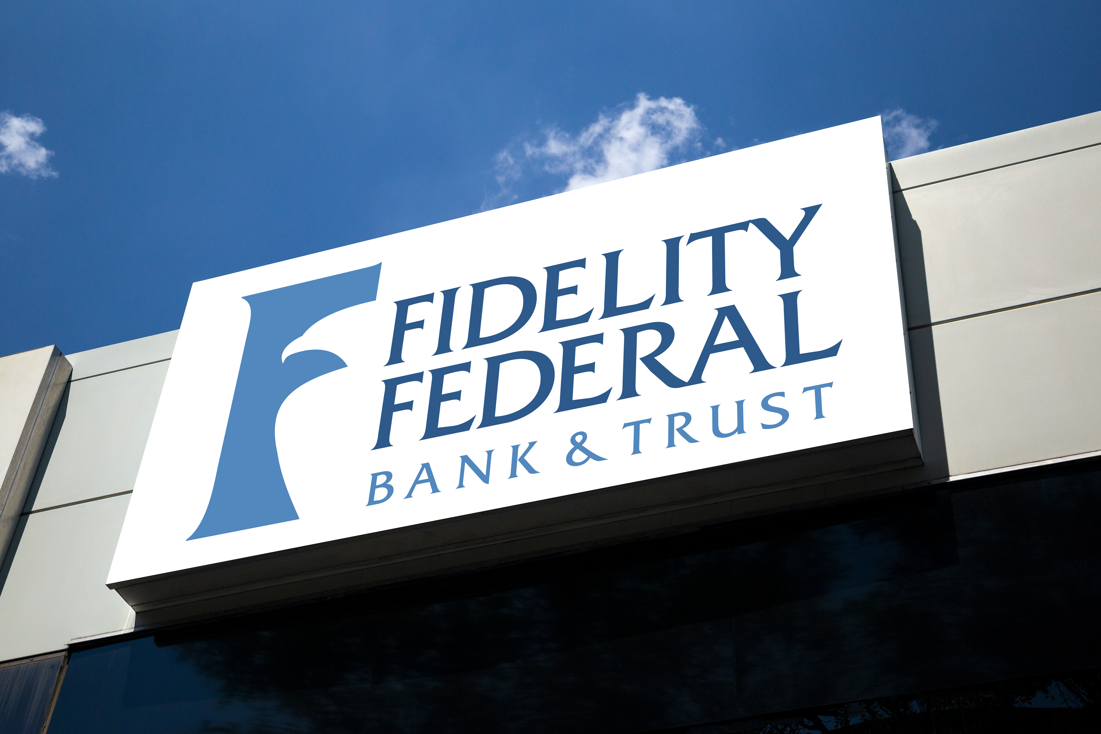
Whatever the reason, that opportunity became a turning point. I threw myself into the challenge... and not only did the client love one of my designs, but for the first time, I felt certain I had chosen the right profession. It sparked a confidence I didn’t know I needed. Even more to my delight, with 52 branch locations throughout Florida's east coast, everywhere I went there it was, on signage larger than life.
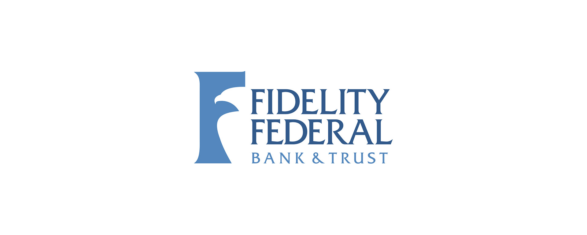
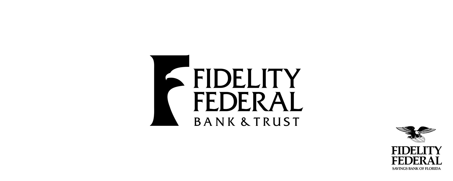
The brief called for modernizing a decades-old logo featuring a line-art eagle surfing on a shield. This concept's meaning had long been lost. The client wanted to retain the eagle and original type treatment to preserve some brand recognition, but also wanted something that felt more contemporary and professional. At the time, the TV series Law & Order was at its peak, and I had overheard the client mention their fondness for the logotype.
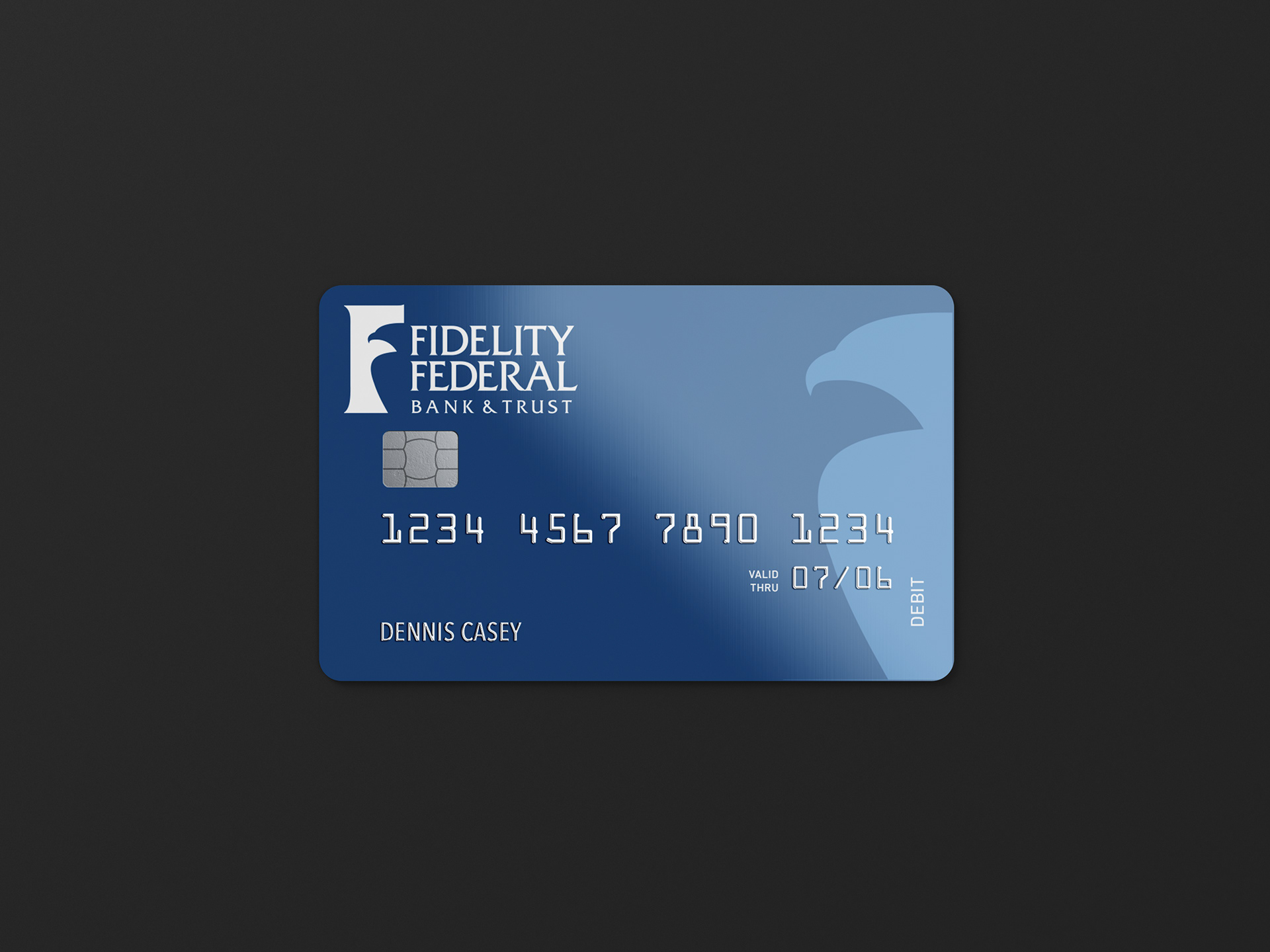
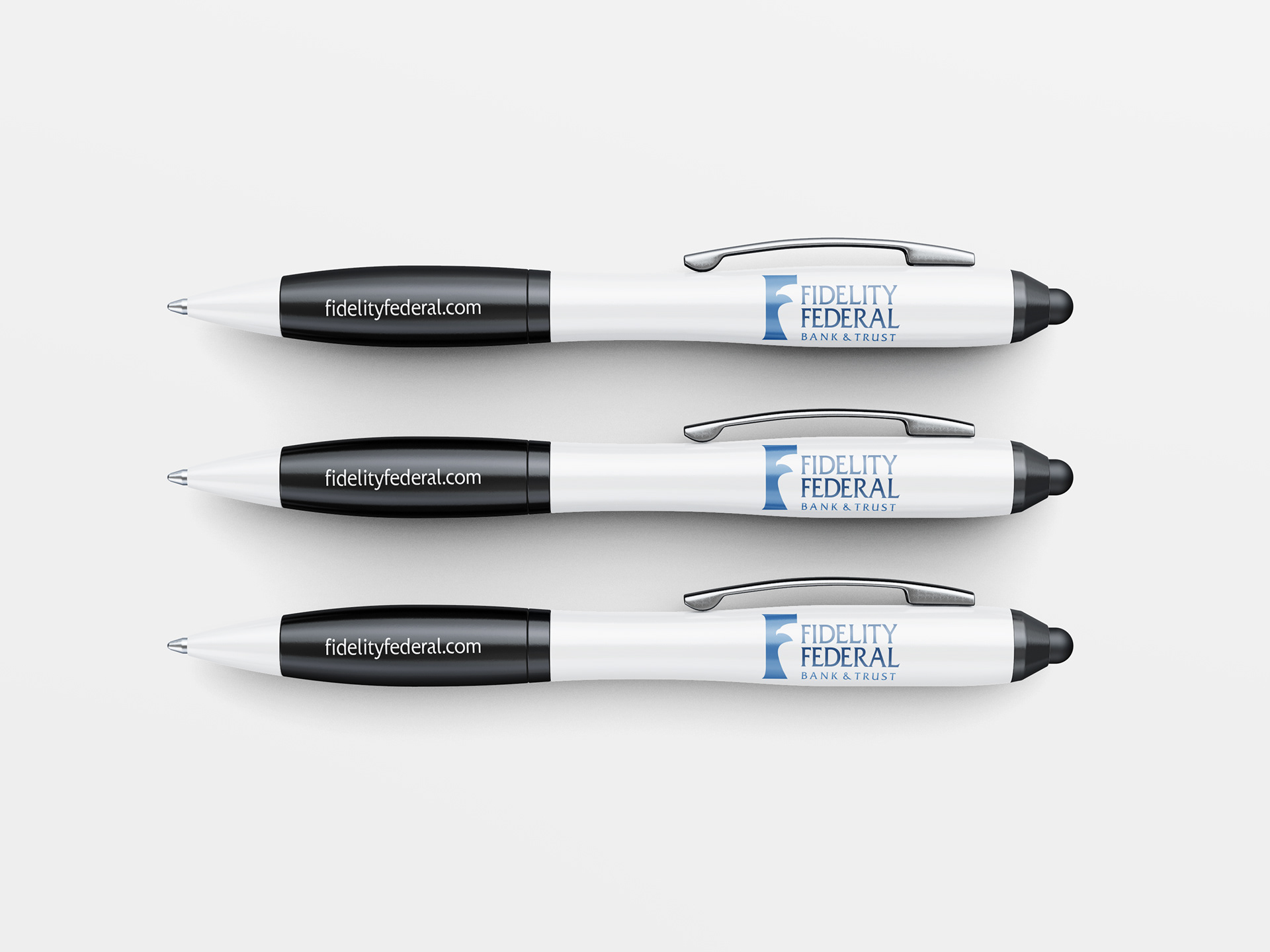
Inspired by that, I designed a silhouette of an eagle in the negative space of the letter F and paired it with a refined version of the typeface. The result marked not only a visual transformation for the brand, but a defining creative moment for me as well. Though the logo has long since vanished from public view, its true legacy endures... the unmistakable moment I claimed my place as a designer, and knew I was meant to be here.